


Yahoo - shopping app
—
Shopping iOS/Android is an E-commerce platform and was selected by the Apple store as the best new app and number one shopping app in Taiwan. I was very excited to be a part of this scrum team. It was my first UX/UI project at Yahoo. I delivered some of the product design features, including category experience, favorite brands, multiple item promotion and order status at that time. I was responsible for interaction design, planning, understand product requirement, address the problems, visual design, discuss with stakeholders, prototyping and ensure the production quality for both iOS and Android platform.

Shopping iOS/Android is an E-commerce platform and was selected by the Apple store as the best new app and number one shopping app in 2016.
Design Process
At the early stage of our product development process, we will have a kick-off meeting with stakeholders. After we understand their strategy and vision, we won’t just start design and sketch, we want to learn from users and find out users needs and pain points. So we will start from observation, understanding users' shopping behavior, walking into their daily lives, visiting their favorite spots.
After that, we define our hypothesis then start to design our features. In terms of post MVP strategy, we would iterate the design after the first version has lunched, PM and product designer will setup the goal for next version, e.g. increase the users’ retention rate, conversion rate, rating and daily active user. Then design side will based on those successful metrics to rethink the possible direction for next version.

Category Design
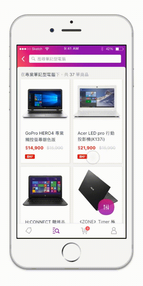
"Category" feature is my first project at Yahoo. The goal is to improve the overall browsing experience and help user to find item from our category list.
In category design, we use list view design with category-related photos so that our user can easily and quickly browse the category they want. When users select a category, they will see a list of clusters from our backend data. Each cluster contains a cluster image and title. Once users choose any cluster, they will be taken to a listing page. When users search on a category main page or category page, we show them search results from the whole site. If users search on other cluster page, we show them the search results under that cluster.

Iterations & prototyping
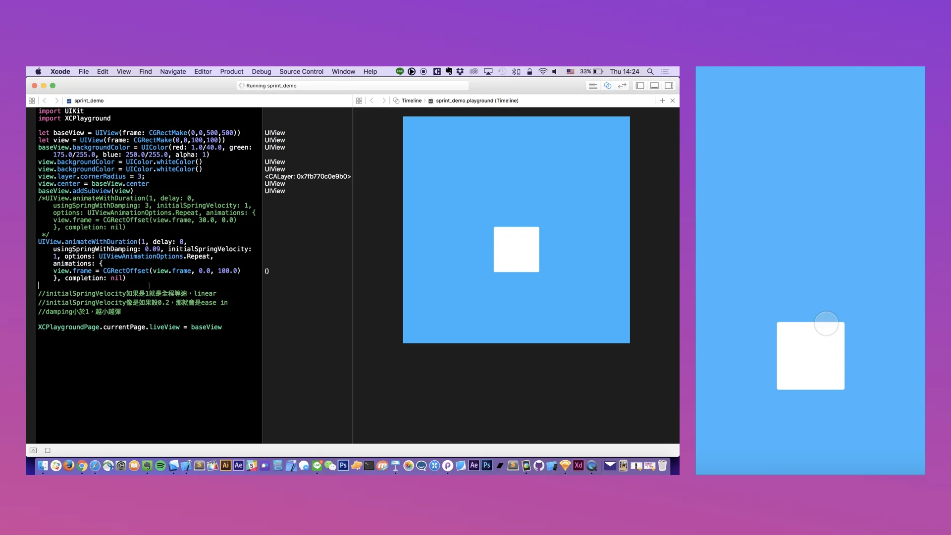
Usually, I will understand the context first to see if this is a minor improvement or a brand new feature for our shopping app. After I understand the scope and overall context, I began to sketch as many different directions as possible, then pick a few assumptions to test them out in a prototype. After getting to a good place with each iteration in Sketch, I would then turn to Framer Studio then present it to all stakeholders in the daily standup meeting.


Interaction design solutions
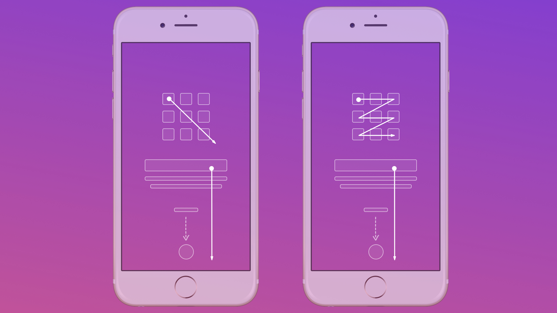
We hope users can browse categories and clusters on one page and don’t need to go back-and-forth. My challenge - designing an interaction so that users can easily switch category page and cluster page - is to think about the continuous experience between the first card and second card. The main concept was to keep the navigation and tab bar, the transitions between categories and clusters animated. To the user, this is one continuous space. So the same background element transition on different screens could be seen as the connection between category and cluster page. In this case, the category title and background always remains one cohesive element; it simply changes its representation over time.
Iteration #1 for category
This prototype's problem is readability. I put category title to the right hand side. To improve the reading experience, we decided to try more versions. Play with the #1 prototype Here
Iteration #2 for category
Even though I improved the readability, I still feel the relationship between category and cluster is not good enough. Play with the #2 prototype Here

Iteration #3 for category
In this version, I use an animation and strong visual hierarchy that elegantly explains where the clusters come from and where they are when they’re not visible. Play with the #3 prototype Here

Other feature I've done in Yahoo! Shopping Team
—
Filter experience for search result page
To improve browsing experience, filter is another key feature that we need to do. Filter feature for search result page allows user discover the items easier. It contains several filer attributes and sorting logic. This was an exciting project since I love to buy something on shopping app. I had always dreamed of creating this filter feature to make the experience better and I finally got the chance! See the video here

Increase the visibility of the items on search result page
To increase the density and improve the browsing experience for search result page. We decided to add micro-interaction when user scrolling up and down. E.g. when user scrolling down, they can focus on search result page then the navigation and tab bar will be hidden temporarily. See the video here
Multiple items page - filter experience
In shopping app, we have tons of good deals that user can keep exploring and shopping. But our user is hard to find out the item when there're so many good deals on the promotion page. The only thing they can do is just keep scrolling the page which is a very bad experience. Therefore, we decided to have a light way filter experience to help the user discover deals easier. See how it works here

Multiple items page - better navigation experience
To improve the browsing experience and increase the content density, we add some micro-interaction for this page. See the video here

Onboarding experience for shopping app
To introduce some special new feature, we tried to provide a more delightful experience while shoppers using our app. To reduce engineer effort, I also created 3 core principles for this interaction so that they can reuse the same code in the future:
Well-defined content structure for on boarding experience.
Clear motion direction.
Consistent motion value, e.g. the duration should less than 0.5 secs.


Design Highlights
In shopping team, I designed what E-commerce experience for Shopping App can be like. I'm the interaction designer for some projects such as Category Experience, Favorite Brand List, Filter Behavior, Multiple Item Page Filter Experience, Order status, VIP Experience, Search Cluster Backfill, Surface Promotion on SERP and On Boarding Experience for Shopping App.
